Key takeaways
- A TV stand does not have to be identical to your couch, coffee table, or cabinets. If you are asking what should my tv stand match, begin with the room’s most visible fixed finishes, then repeat a compatible wood undertone,…
A TV stand does not have to be identical to your couch, coffee table, or cabinets. If you are asking what should my tv stand match, begin with the room’s most visible fixed finishes, then repeat a compatible wood undertone, hardware color, or design detail. The aim is a room that feels connected, not a furniture set in which every piece looks the same.
As an Amazon Associate we earn from qualifying purchases.
By KK Home Furnishings Editorial Team
What Should a TV Stand Match First?
Start with elements that will remain in the room longer than small decor: flooring, built-in shelving, major seating, and the wall behind the screen. Match one meaningful quality rather than copying everything. The quick reference below shows which connections tend to feel intentional and when a contrasting console can be the better choice.
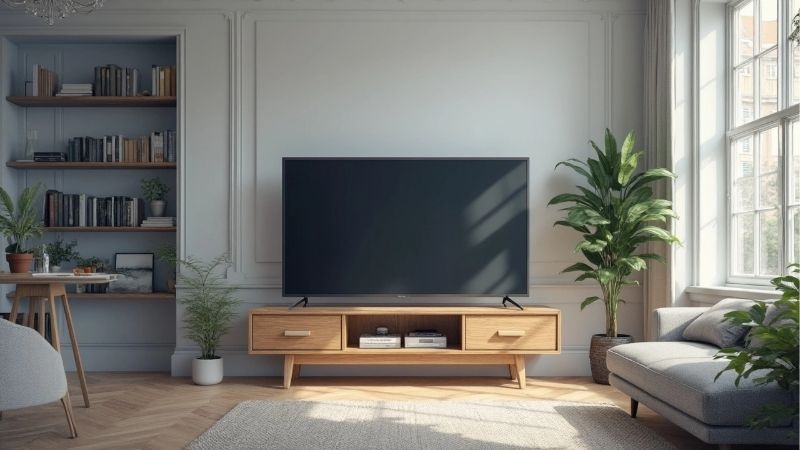
| Room reference | Useful connection for the TV stand | When contrast makes sense | Check before choosing |
|---|---|---|---|
| Wood floor | Related warmth or a repeated grain family | A painted cabinet breaks up too much wood | Compare samples in room light |
| Coffee table | Echo finish, leg shape, or hardware | Different woods can look collected | Avoid accidental almost-matches |
| Sofa | Coordinate visual weight or overall style | A warm sofa can sit beside a cool cabinet | Review rug and cushion bridges |
| Wall color | Coordinate undertone, not identical paint | A light-dark contrast defines the media wall | Test against the real wall |
| Built-in shelves | Repeat one material or door detail | Freestanding stand can remain a feature | Check nearby trim and scale |
| Metal accents | Repeat black, brass, or brushed-metal detail | One deliberate accent is enough | Inspect existing handles and frames |
| Area rug or textiles | Pick up one recurring neutral or accent | A quiet console balances pattern | Check the full palette, not a photo |
Start With Floors and Permanent Architectural Finishes
Flooring is a practical starting point because its color covers a large area and is not easily swapped. On honey-colored oak floors, a softly warm cabinet can feel related even when its grain is different. A painted cream or muted olive console may be more interesting than choosing another orange-toned wood just because it looks close in a catalog.
Look at baseboards, fireplace surrounds, permanent shelves, and door trim before deciding that the coffee table must dictate your purchase. If the room includes several woods already, identify the one that appears most often, then select a console that relates to it or clearly contrasts. A nearly matching stain can look accidental when the pieces meet in daylight.
Coordinate Undertones, Not Perfect Paint Matches
A gray wall may carry a blue, green, or warm brown cast, and beige can lean pink or yellow. Sherwin-Williams explains that neutral undertones influence how a room reads, while Benjamin Moore recommends viewing samples in the actual lighting [Sherwin-Williams, Working With Neutrals; Benjamin Moore, Choosing Paint Color, accessed October 2026].
Instead of shopping for a cabinet described only as “gray,” compare its finish next to a piece of the existing wall color and a flooring sample. An off-white cabinet with a creamy cast can suit warm beige better than a stark bluish white. These are choices to test, not universal rules: daylight, bulbs, neighboring colors, and sheen can change the apparent relationship.
Repeat One Design Detail and Respect Visual Scale
Shape can create unity without identical color. A low walnut TV stand with thin black legs may relate to a black-framed side table more naturally than an oversized matching walnut cupboard would. Consider whether the room favors simple horizontal lines, detailed molding, curved edges, or rustic texture, then reflect just one or two of those characteristics.
The cabinet also needs to suit the television and the wall visually, but decoration never overrides support requirements. If the television sits on furniture, use a TV-rated stand and follow the model’s securing instructions. The U.S. Consumer Product Safety Commission advises purpose-built TV furniture and anchoring against tip-over [CPSC, Anchor It!, 2026].
Adjust for Your Situation
There is no single object that every media console must match. These situations make the decision more useful: sometimes a repeated finish is the easiest anchor, sometimes a contrasting material keeps the room from feeling flat, and sometimes the right connection is the cabinet’s shape rather than its color. Choose the scenario closest to your existing space.
1. When You Already Have a Wood Coffee Table
Let the coffee table and TV cabinet share one recognizable detail, such as a medium-brown tone, visible grain, slim legs, or a black metal accent. They do not need to come from the same brand or collection. If the coffee table is heavily grained oak, a quieter solid-color media console can preserve that wood as the room’s main texture.
Avoid buying a second wood finish from a small website photo alone. Stain, grain direction, lacquer sheen, and lighting can alter its appearance. Ask for finish samples when available, or compare a close-up image against your table under daylight. If the two woods are clearly different, use a rug or neutral sofa to connect them rather than pretending they match exactly.
2. When Your Flooring Is Dark or Strongly Patterned
A lighter media console can create useful separation from espresso or dark walnut flooring, particularly when the TV wall is also deep in color. Look for a finish that repeats the floor’s warm or cool character without repeating the same depth. Pale natural wood, subdued cream, or a softer mid-tone can keep the lower wall from becoming one dark block.
A dark-on-dark scheme can also work when the room has enough light and deliberate contrast from a rug, trim, or upholstery. Judge the result from your usual seating position, not only while standing near the cabinet. If the stand disappears into the floor and wall, the relationship may need a lighter texture or different sheen rather than another decorative object.
3. When the Sofa Is Beige and the TV Stand Is Gray
A beige sofa and gray console can work together without being identical. First determine whether the beige feels golden, sandy, or pink, and whether the gray leans blue, green, or taupe. A warm greige cabinet often connects readily with a sandy sofa; a cool charcoal cabinet may look better when the rug and artwork intentionally introduce cooler tones.
Do not treat this as a rigid prohibition against mixing warm and cool colors. Instead, examine the entire room in daylight and at night. A rug that contains both beige and charcoal, or a few repeated dark frames, can make contrast look planned. Keep the media console itself simple so the upholstery and the cabinet are not competing to be the only focal point.
4. When the Walls Are Gray but Your Furniture Is Mixed
Use the wall as a background reference, not an order to buy a gray stand. Warm wood or softened white can provide relief against a cool gray wall; darker walnut can feel grounded against paler greige. The precise direction depends on the wall’s undertone, the floor, and how much natural light reaches that side of the room.
For this situation, the dedicated gray-wall color guide can handle individual shade pairings. Here, the broader rule is simpler: the console should connect to at least one existing element besides the paint. A repeated wood temperature, door profile, or metal detail gives the room continuity even if the stand’s main color contrasts with the wall.
5. When the Room Has Black Metal or Brass Accents
Hardware offers an easy visual bridge when wood finishes differ. A media cabinet with dark handles can relate to a black-framed side table or floor lamp, while a restrained brass detail can connect to existing cabinet pulls. The repeated metal does not need to appear on every piece, and an entire room of identical shiny finishes may feel overly staged.
Compare sheen as well as metal color: matte black and glossy black do not read exactly alike, nor do antique brass and bright polished gold. If your room already contains mixed metals, choose the finish that appears in the largest nearby features or keep the cabinet hardware subtle. A color echo is useful, not a requirement to replace functioning fixtures.
6. When Your Room Is Farmhouse, Traditional, or French Country
Match the cabinet’s visual language rather than copying distressed paint from every surface. In a farmhouse room, understated panel doors and a relaxed wood finish may connect better than adding more decorative distressing. In a French-country setting, a muted finish or shaped edge can relate to existing furniture without turning the TV wall into a themed display.
Traditional rooms can accommodate a simpler contemporary media console when the proportions and finish are sympathetic to nearby pieces. Notice whether your furniture has thick bases, fine legs, ornate edges, or smooth fronts. Select one connecting feature and allow the television area to be quieter; that restraint often supports a room filled with other details.
7. When Your Living Room Opens Into Other Spaces
In an open-plan apartment, the media console may be visible beside dining furniture or a kitchen island. Choose one finish or form that continues across the shared view: perhaps light oak from the dining table, black frames from kitchen stools, or the same warm off-white used on nearby cabinetry. You do not need to copy all three elements.
If the surrounding furniture is intentionally eclectic, an understated TV stand can act as a resting point. IKEA’s U.S. room examples demonstrate both coordinating furnishings from a family and mixing color and material deliberately [IKEA, Harmony With HAUGA Series; Colorful Scandinavian Living Room, accessed October 2026]. Treat these as design options, not rules for a matched set.
Frequently Asked Questions
After the main materials and style feel connected, smaller decisions can still make a cabinet seem out of place. These answers address the boundaries of matching rather than repeating the color-palette guide. Test close decisions against the actual room and preserve the manufacturer’s intended support and installation requirements regardless of the look you prefer.
Should My TV Stand Match the Bookshelf Beside It?
No. A bookshelf and media console can feel related through cabinet-door profiles, shelf thickness, hardware, or one shared color without using the same finish everywhere. When they sit side by side, a common detail is particularly helpful because viewers read them as a group. The pieces do not need identical heights, widths, or manufacturers.
If the bookshelf is an ornate dark wood, consider a simpler cabinet in a related warm finish so the wall does not feel busy. If it is painted white, you might repeat its white in the TV stand legs or surrounding trim while choosing another main cabinet color. Decide which piece deserves attention and which should quietly support it.
Can Matte and Glossy Furniture Finishes Work Together?
Yes. Different sheens can add depth even when the furniture colors are close. A matte black media console beside a slightly polished wood coffee table can feel considered rather than mismatched. The more important question is whether the finishes look deliberate under your room’s real light and whether reflections distract from the television.
Glossier surfaces can reveal fingerprints and reflected light more clearly, so placement and everyday care deserve attention before you choose them. Review the maker’s cleaning instructions for painted, lacquered, or veneer surfaces; do not assume the same polish suits every finish. A furniture sample is more useful than a dramatic store photograph.
Does a Black Television Need a Black TV Stand?
No. The screen bezel is a technology finish, not a command for the entire furniture palette. Black televisions can sit above natural oak, warm white, walnut, or colored media cabinets. If the dark screen feels visually isolated, repeat black in one small nearby detail, such as a lamp base or frame, rather than repainting the stand to match it.
Keep the choice in perspective: the cabinet occupies the lower wall even when the TV is off, while the screen becomes the dominant image when you watch. A stand that fits the rest of the furniture may therefore be the more flexible purchase. If you use the TV’s own feet, confirm the cabinet is approved for the set independently of its finish.
What if the TV Stand Finish Looks Different at Home?
First evaluate it in morning daylight and after dark with your normal room lighting. A subtle undertone difference may disappear when the rug and artwork are in place, while a strong clash with the floor may remain noticeable. Benjamin Moore recommends comparing samples in changing light; the same observation helps when judging furniture finishes [Benjamin Moore, Choosing Paint Color, accessed October 2026].
Before modifying a purchased cabinet, compare the actual finish with the product description and retailer’s return conditions. For a small mismatch, a separate rug or repeated material may create a bridge. If the stain is fundamentally unlike the advertised finish, a return or exchange may be wiser than attempting to strip or repaint factory veneer.
Final Thoughts
The best response to what should my tv stand match is to choose one dominant reference: flooring, a nearby furniture finish, or the room’s overall style. Echo a compatible undertone, shape, or hardware detail while allowing contrast elsewhere. Check the real finish in your lighting, and never sacrifice TV support or anchoring requirements for a closer visual match.