Key takeaways
- Walnut, light oak, soft white, and matte black media consoles can all look good against gray walls. The useful answer to what color media console with gray walls depends on the wall’s warm or cool undertone, available daylight, and whether…
Walnut, light oak, soft white, and matte black media consoles can all look good against gray walls. The useful answer to what color media console with gray walls depends on the wall’s warm or cool undertone, available daylight, and whether you want the cabinet to blend in or stand out.
As an Amazon Associate we earn from qualifying purchases.
By KK Home Furnishings Editorial Team
Which Media Console Colors Work With Gray Walls?
Start with the painted wall, not a furniture color trend. Warm gray and greige often sit comfortably beside brown woods; cooler gray can feel crisp with black or pale oak. Neither pairing is guaranteed until you put the actual cabinet finish against the wall in the room’s normal lighting. The table below is a choice guide, not a set of mandatory rules.
| Gray Wall Condition | Suggested Console Finish | Why It Works | Watch Out For |
|---|---|---|---|
| Warm gray or greige | Medium walnut or brown wood | Adds depth without relying on cool contrast | Red-toned stain may fight pink or violet decor |
| Cool blue-gray | Light natural oak | Introduces a warm material beside cool paint | Yellow/orange stains can appear too strong |
| Pale neutral gray | Matte black or charcoal | Defines the screen and storage visually | Dark finishes can reveal dust in side light |
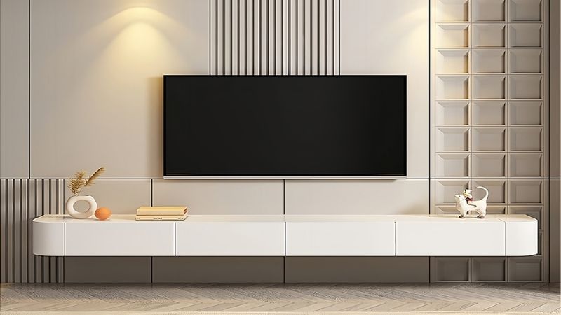
| Deep charcoal gray | Soft white or ivory | Makes cabinet edges easier to see | Bright white can feel stark under warm lamps |
| Low-light gray room | Warm off-white with subtle grain | Keeps a heavy cabinet from darkening the wall | Check how cream shifts under evening bulbs |
| Medium gray with ample light | Muted sage-green | Offers a deliberate soft-color accent | Sample to avoid a muddy gray-green mismatch |
| Gray-on-gray preference | Gray clearly lighter or darker than wall | Creates a restrained layered effect | Near-identical gray can look accidental |
Identify the Undertone Before Choosing a Finish
Gray paint is not a single neutral. A beige or brown cast tends to read warmer, while blue and green undertones tend to read cooler. Benjamin Moore’s gray-paint guidance makes that distinction and advises using existing room materials as a reference. Compare your wall with plain white paper and a few color samples, not only with a phone photograph.
Look at the wall beside the proposed console location, not just across the room. Flooring, a hearth, and nearby trim can change what seems harmonious, so the undertone is a starting point rather than a command to match every surface. If a cabinet finish clashes with the floor, choose a quieter finish even if it appears to match the paint sample perfectly.
Choose Whether the Console Should Recede or Define the TV Wall
A media console is a broad horizontal shape underneath a dark screen. A pale cabinet can feel quiet against a light wall; a charcoal or black one sets a firmer boundary. With deep gray walls, cream or soft white can restore separation. The practical decision is whether you want the television area to be a background element or an obvious focal point.
Judge the contrast from your normal seat while the television is off. A cabinet almost identical in color and brightness to the paint may visually disappear, which can be intentional, but its handles and edges can also become hard to distinguish. Change the finish’s lightness or add wood grain rather than forcing an exact gray-on-gray match.
Test the Real Finish in Daylight and Evening Light
A screenshot cannot reliably tell you whether a white console will look blue, ivory, or yellow beside your walls. Benjamin Moore recommends checking paint samples at several times of day because natural exposure and lamp temperature shift perceived color. The same principle applies to cabinet fronts, especially glossy laminate, stained veneer, and dark matte surfaces.
Bring home a cabinet door sample, finish chip, or a returnable small piece in the same color when possible. Hold it vertically against the TV wall and inspect it with window light, curtains closed, and your usual lamps on. A store’s label of walnut, oak, white, or gray identifies a finish family, not a promise that it matches your actual room.
Adjust for Your Situation
Different gray rooms call for different cabinet finishes. The seven cases below translate the color choices into purchase decisions, including when a finish is worth sampling and when it is better avoided. They address media-console color specifically, not a complete living-room makeover.
Warm Greige Walls: Choose Walnut for Grounded Contrast
If the paint reads beige-gray or mushroom, a medium walnut media console is a strong first sample. Brown wood reinforces the warmth already present in greige without needing a second large painted accent. A simple-front cabinet works especially well when you want the grain itself to supply the detail rather than ornate handles or decorative open shelves.
Check for a red or orange cast in the specific walnut-look finish. A soft brown often reads more settled beside taupe walls than a cherry-colored stain, but room flooring can reverse that impression. The IKEA BESTÅ range, for example, lists a brown walnut-effect front; this is a finish option, not evidence that its panels are solid walnut.
Choose this route when the room’s floor or other nearby wood has a related, not necessarily identical, warmth. Skip it if the proposed cabinet looks reddish against a strongly green-gray wall, or if your dark television and flooring already make the entire wall feel too heavy.
Cool Blue-Gray Walls: Try a Light Natural Oak Finish
Pale oak introduces grain and a small amount of warmth beside a blue-gray wall. The contrast is mostly material and undertone rather than a dramatic difference in darkness. This is useful if a black cabinet feels too severe, yet a painted gray cabinet feels flat. Pick a natural or gently washed appearance before considering heavily yellowed stains.
Examine the sample beside both the wall and the floorboards. A light oak-effect cabinet may have a printed grain, while some products use actual wood veneer; the look can be similar in photographs but the materials and care instructions differ. Check the seller’s exact finish description rather than turning an appearance label into a material claim.
Select this when you want the media cabinet to warm a cool paint scheme without committing to a bold furniture color. If the room has strong golden-oak flooring already, choose a finish that is deliberately lighter or deeper instead of a second almost-but-not-quite matching yellow wood.
Light Neutral Gray Walls: Use Matte Black for Definition
Matte black or black-brown can give pale gray walls a clean architectural base for the TV. The cabinet reads as an intentional horizontal piece rather than another pale block. This works best when you want the screen and storage to feel visually linked and when the wall has enough open area that the darker silhouette will not crowd the room.
Before ordering, check how much of the dark surface will be exposed to side lighting. A flat black top can make dust or fingerprints noticeable, while a textured door front may look different at night than it does online. If the room has little daylight, test a charcoal finish next to black; the softer contrast may be easier on the eye.
Choose a closed-front design if you want the dark cabinet face to look simple when electronics are stored. Avoid black solely because it is fashionable: if the TV already fills a narrow wall and the floor is dark, a lighter finish can provide better visual breathing room.
Dark Charcoal Walls: Contrast With Soft White or Ivory
Against deep charcoal or slate paint, a soft white media console gives a clear edge underneath the screen and keeps drawers readable. Ivory can be less stark than brilliant white under warm lamps. This is a finish choice rather than an attempt to make the entire room light; the contrast is concentrated at the cabinet where its function is most visible.
Compare the proposed white with baseboards and nearby trim. A cool, crisp white next to creamy trim can look unrelated, while two subtly different whites can work if the finishes are separated by the wall. Do not rely on manufacturer color names alone: one company’s white may appear noticeably warmer than another’s.
Choose the brighter cabinet if a dark screen and deep wall paint already make the media area feel visually dense. Skip ultra-high-gloss white when windows or lamps are reflected strongly across the cabinet face; a lower-sheen finish can support a calmer TV-viewing wall.
Gray Walls in a Dim Room: Favor Warm Off-White and Gentle Texture
A gray room with limited daylight often needs a cabinet that does not add another large dark surface. Warm off-white, light cream, or a pale wood-look front can achieve that without repainting. The priority is the finish’s appearance under the lighting you actually use, not a claim that one shade will automatically make the room brighter.
North-facing rooms can bring out blue or green undertones in gray paint, as Benjamin Moore notes. A warm cabinet sample may therefore appear more yellow beside the wall than it did at the store. Inspect an ivory sample and a pale wood sample side by side after sunset before making a final choice.
This is the safest visual starting point when a black unit looks too heavy, but do not pick cream blindly if the existing trim is an icy white. Favor a restrained contrast with the installed wall and test cabinet-door samples rather than making the decision from color descriptions.
Well-Lit Medium Gray Walls: Consider Muted Sage for Color
A muted sage-green media console is an option when neutral woods, black, and white feel too predictable. It works as a purposeful furniture accent under a TV rather than an attempt to introduce color across every wall. Choose a quiet, gray-leaning green instead of a vivid leaf green if you want the cabinet to stay subordinate to the screen.
Real retail finishes can help establish the category: IKEA lists a BESTÅ door-front combination in a dark gray-green family, though selection changes and the exact appearance depends on the chosen components. Examine the assembled frame and front together; a warm black-brown frame can change how a sage-colored door looks beside cool gray paint.
Use a colored cabinet when the rest of the wall is relatively simple and you want one intentional accent. If your gray paint already looks green in north light, compare samples carefully: too similar a green-gray may merge with the wall, whereas a deeper, clearer sage can remain distinct.
Gray Console With Gray Walls: Separate the Values on Purpose
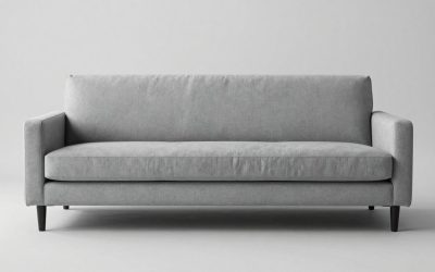
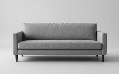
Gray cabinetry is not off-limits against gray walls. It works best when you choose a noticeably lighter or darker cabinet or when its grain, texture, and sheen differ enough to reveal the silhouette. A medium-gray cabinet on medium-gray paint with the same cast and finish can look like an accidental near-match rather than a considered choice.
Take a sample of the wall paint to the showroom, then assess the actual cabinet in the room if you can. A warm charcoal can look brown beside a blue-gray wall, and a cool gray laminate can look lavender under a warm bulb. Neither is intrinsically wrong; the question is whether the result feels deliberate when viewed beside the TV.
Keep this decision at the cabinet level rather than trying to create a full monochrome room scheme. If you have already chosen gray seating and textiles, evaluate those in a separate whole-room plan; for this purchase, prioritize readable door fronts, compatible finish materials, and an intentional contrast at the media wall.
Frequently Asked Questions
Once the finish is shortlisted, practical surface and hardware questions can change the result. Gloss, glass doors, paintability, and the dark TV frame affect how the same color reads in daily use. These points help settle a purchase without reopening a whole-room color plan or repeating the undertone selection process.
Is a glossy media console a good idea against gray paint?
It can be, but only when you are comfortable with reflections and the extra visual shine. High-gloss white or black cabinets may appear sharper than matte finishes beside a softly painted gray wall, especially when windows face the media area. The choice is about where the light falls, not a universal rule about gloss.
If possible, view a sample at the angle of the actual TV wall with your television switched off. Reflections from lamps can make a glossy top distracting, while matte surfaces may make handling marks and dust visible in a different way. Choose the maintenance and reflection trade-off you prefer.
Do glass doors change the way a cabinet color reads?
Yes. Clear or smoked glass interrupts the uninterrupted look of a painted or wood-grain front because interior shelves and equipment remain visible. A partly glass-fronted cabinet may appear darker if it contains black electronics, even if its surrounding frame is white or light oak.
If you want an uninterrupted color block under the television, compare solid doors against the same cabinet with glass doors. If you use remote controls or AV equipment behind doors, check the device’s ventilation and remote-signal needs before prioritizing the look; appearance should not determine equipment compatibility.
Can an existing media console be painted to suit gray walls?
Often, but prep depends on the actual substrate and surface coating. Painted wood, veneer, laminate, and foil-covered particleboard do not accept refinishing in the same way. Check the manufacturer’s care guidance or ask the paint supplier for a compatible bonding primer and topcoat before buying supplies.
Test a hidden area first and allow the sample to cure as directed. Repainting can make sense if the cabinet is structurally sound and only its color feels wrong, but avoid promising a durable result on a slick factory film without confirming that the selected coating system is made for that material.
Should the media console color match the TV frame?
No. A black screen frame can sit above a pale oak, cream, walnut, or colored console without looking inconsistent. The cabinet finish is a piece of furniture; the TV frame is a functional equipment border. Match them only if you want a dark, continuous silhouette across the media wall.
Test the cabinet choice with the TV turned off because the dark rectangle becomes more visually prominent in that state. If the frame and cabinet are both black, check that the result does not feel like one heavy block; a matte charcoal finish or a wood-front detail can provide a subtle separation.
Final Thoughts
For what color media console with gray walls, start with walnut or oak for warmth, soft white for contrast against dark gray, and matte black for definition against pale gray. Sage or a contrasting gray can work when sampled carefully. Let the real wall undertone, finish material, and everyday lighting decide the final color.